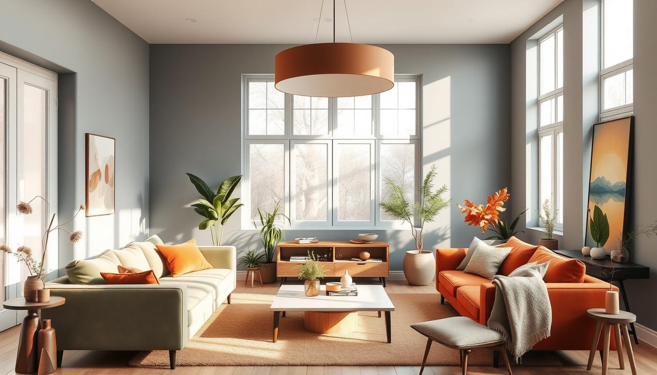
Looking ahead to 2025, interior design will focus on sustainability and nature-inspired colors. Experts predict earthy tones and rich jewel tones will be all the rage.
Benjamin Moore’s Color of the Year 2025, Cinnamon Slate 2113-40, showcases this trend. It’s a blend of heathered plum and velvety brown, adding warmth to any space. We’ll dive into the top interior design trends for 2025. You’ll learn about the most sought-after colors and palettes that will define interior design.
Key Takeaways
- Earthy tones and rich jewel tones will dominate interior design in 2025.
- Nature-inspired colors will be a major influence on interior color trends.
- Benjamin Moore’s Color of the Year 2025 is Cinnamon Slate 2113-40.
- Sustainability will play a key role in shaping interior design trends.
- Warm and inviting color palettes will be popular in 2025.
A Look Back: Color Trends of 2024
In 2024, interior design was all about warm tones, calm colors, and lots of blues. This mix showed how tastes were changing and hinted at what’s coming in 2025. Looking back at 2024’s trends helps us see where interior design is going.
What Worked Last Year?
Last year, warm tones and bold colors were big. Blues of all kinds were also very popular. We also saw a mix of bright pinks and deep darks, showing a wide range of styles.
Some top colors of 2024 were:
- Warm neutrals like beige and taupe
- Bold blues, from sky blue to navy
- Preppy pinks, adding a touch of playfulness
- Moody darks, used to create cozy, intimate spaces
Key Takeaways for 2025
Knowing 2024’s color trends helps us see how tastes are evolving for 2025. The trends of last year set the stage for the more detailed and varied color schemes of 2025.
| Trend | 2024 Characteristics | 2025 Evolution |
|---|---|---|
| Warm Tones | Prominent use in living areas | More nuanced, layered applications |
| Bold Colors | Used in statement pieces and accent walls | Integration into more subtle, everyday designs |
| Blues | Variety of shades, from light to dark | Continued popularity with new shades emerging |
By looking at these trends, we can understand where interior design is headed. This helps us make smart choices for our own spaces.
Pantone’s Color of the Year 2025
Looking ahead to 2025, the interior design world buzzes with excitement. Benjamin Moore has picked Cinnamon Slate 2113-40 as the Color of the Year. This color is a mix of heathered plum and velvety brown, adding warmth and comfort to any space.
Significance of the Chosen Color
Cinnamon Slate 2113-40 is more than a color; it’s a sign of design trends and what people want. It’s chosen to make homes cozy yet sophisticated. This color will influence everything from wall paint to furniture and accessories.
Key Features of Cinnamon Slate 2113-40:
- A unique blend of heathered plum and velvety brown
- Creates a cozy and inviting atmosphere
- Versatile for use in various design elements
To see how this color stands out, let’s compare it with others. We’ll look at warmth and sophistication levels.
| Color | Warmth Level | Sophistication Level |
|---|---|---|
| Cinnamon Slate 2113-40 | High | High |
| Soft Gray | Low | Medium |
| Warm Beige | Medium | Low |
How to Incorporate It in Your Home
Adding Cinnamon Slate 2113-40 to your home decor is easy. Here are some ideas:
Accent Walls: Use this color for an accent wall to add warmth and depth.
Furniture: Choose furniture or statement pieces in this color for a unified look.
By using Cinnamon Slate 2113-40 in your decor, you’ll make your home welcoming and stylish. It shows off the latest in interior design.
Nature-Inspired Color Palettes
Nature-inspired color palettes are changing home decor in 2025. They bring a calm and organic feel. Homeowners are choosing earthy tones and greens and browns to make their homes peaceful.
Earthy Tones for a Calming Feel
Earthy tones like brown, beige, and green are used to make homes calm. These colors connect us to nature, bringing peace and quiet.
Some popular earthy tones in 2025 include:
- Terracotta: A warm, earthy shade that adds coziness to any room.
- Sage Green: A soft, muted green that brings a sense of balance and harmony.
- Sandy Beige: A neutral, calming shade that works well with various decor styles.
Layering Greens and Browns
Layering greens and browns creates a rich, natural look. This involves mixing light and dark shades for depth and interest.
For example, light sage green with deep forest green makes a stunning contrast. Mixing browns, from tan to chocolate, adds warmth and coziness.
| Color | Shade | Effect |
|---|---|---|
| Green | Sage | Calming |
| Brown | Terracotta | Cozy |
| Beige | Sandy | Neutral |
Using these nature-inspired colors in your home decor makes it peaceful and welcoming. It shows the beauty of nature indoors.
Bold and Vibrant Colors
In 2025, bold colors are back in a big way, changing how we decorate our homes. It’s key to know why and how to use these bright hues.
Why Bright Hues Are Making a Comeback
After a time of calm colors, bold ones are back. Designers say it’s because we want to show who we are through our homes. Emily Henderson, a famous interior designer, says, “Bold colors let us show our style and make our homes truly ours.”
Bright colors are not just pretty; they also change how we feel. They make our spaces look great and feel uplifting.
Best Combinations with Bold Colors
Bold colors are even better with the right friends. Here’s how to mix them:
- Match bold jewel tones with neutral backgrounds for a strong contrast.
- Pair vibrant colors with earthy tones for a balanced look.
- Use bold colors as accent walls or pieces to add depth.
Exploring bold colors is more than just looks; it’s about showing our personality. By trying out different mixes, we can make spaces that are truly our own and inspiring.
“The right color can completely transform a room, making it feel more vibrant and alive.” –
Soft Neutrals: The New Classics
Soft neutrals are taking over the world of interior design. They bring calm and sophistication to any space. These colors are timeless and versatile, fitting well with many decorating styles.
Soft neutrals are more than just a trend. They greatly impact a home’s feel. The right neutral shade can make a space welcoming and stylish.
Balancing Subtlety with Style
Finding the right balance with soft neutrals can be tricky. It’s all about the look you want for your home. For example, soft walls paired with bold furniture can add elegance.
Adding different textures through furniture and decor can also make a space interesting. This keeps the calm feel while adding personality.
Popular Neutral Shades to Consider
There are many popular neutral shades to choose from. Some favorites include:
- Soft whites and creams, which add warmth and coziness.
- Gentle beiges and taupes, for a natural feel.
- Muted grays, for a modern and sophisticated look.
Let’s look at how these shades can be used in your home:
| Neutral Shade | Description | Best Used In |
|---|---|---|
| Soft White | Warm and inviting, ideal for creating a cozy atmosphere. | Bedrooms, Living Rooms |
| Gentle Beige | Natural and earthy, perfect for a calming environment. | Home Offices, Kitchens |
| Muted Gray | Sophisticated and modern, great for a sleek look. | Bathrooms, Dining Rooms |
As the table shows, each shade has its own unique qualities. They can be used to achieve different looks in different rooms.
Understanding soft neutrals and how to style them can create a beautiful home. It reflects your personal taste and makes your space inviting.
Accent Wall Ideas for 2025
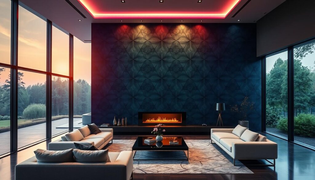
Accent walls are big in 2025, with people choosing bold colors to brighten up their homes. This trend is all about adding a personal touch and making a room’s focal point.
Trending Colors for Accent Walls
In 2025, accent walls will feature bold and vibrant colors. Some top picks include:
- Deep blues and greens, which add a calming yet dramatic effect to rooms.
- Rich terracottas and earthy tones, bringing warmth and coziness to spaces.
- Bold yellows and oranges, perfect for creating a vibrant and energetic atmosphere.
These colors can be used alone or mixed to create a unique look that shows off your style.
“The right accent wall can completely transform a room, making it feel more dynamic and interesting.”
How to Choose the Right Accent
Choosing the right accent wall color involves thinking about a few things. You need to consider the room’s purpose, the colors already there, and what you like.
| Room Type | Suggested Accent Color | Effect |
|---|---|---|
| Living Room | Deep Blue or Green | Calming and Dramatic |
| Bedroom | Soft Gray or Beige | Soothing and Relaxing |
| Kitchen | Bold Yellow or Orange | Vibrant and Energetic |
By thinking about these things and the trending colors, you can pick an accent wall that makes your space better and shows off your style.
Textured Finishes and Their Influence
Texture is changing how we see color in our homes. It’s a key part of 2025’s interior design trends. Texture is not just something added; it’s a core element that shapes modern color schemes and new interior design hues.
The Role of Texture in Color Trends
Texture brings a new level to color, both literally and figuratively. It can make colors seem more alive and engaging. “Texture can change how we see color, adding depth and interest,” notes a top interior designer.
By mixing different textures, homeowners can achieve a layered look. This look is both beautiful and complex.
Top Textured Paints and Materials
There are many ways to add texture to your home’s design. Some top textured paints include:
- Venetian Plaster: A classic choice that adds a luxurious, layered look to walls.
- Textured Finishes: Such as those achieved with joint compound or specialized textured paints.
- Natural Materials: Like wood and stone, which can add warmth and depth to a room.
These materials not only add texture but also shape the room’s look. For example, a room with lots of wood might use earthy tones. A room with metallic accents might use bolder, brighter colors.
As we dive deeper into textured finishes in 2025, it’s clear this trend is more than just looks. It’s about making our living spaces more engaging and interactive. By blending texture and color, homeowners can create a unique and welcoming space that shows off their style.
Multifunctional Spaces and Color Choices
With more homes having multifunctional areas, picking the right color scheme is key. As spaces serve many purposes, the color choice is vital for a unified look.
Selecting Colors for Dual-Purpose Rooms
Choosing colors for rooms with two uses is all about versatility. For example, a home office that’s also a guest room should have calming colors. These colors help with work and rest.
Some top color picks for these rooms include:
- Soft neutrals like beige or gray for a clean look.
- Muted greens for calmness in work and rest areas.
- Blues for their soothing effect and focus boost.
Tips for Maintaining Flow Across Spaces
Keeping a smooth flow between spaces is crucial for a unified feel. Here are some tips:
| Tip | Description | Benefit |
|---|---|---|
| Use a Unified Color Palette | Choose a few main colors and use them everywhere. | Creates a sense of continuity and flow. |
| Consider the 60-30-10 Rule | Use 60% of a main color, 30% of a secondary, and 10% of an accent. | Provides balance and visual interest. |
| Flow from One Space to Another | Match colors from one room to the next. | Enhances the sense of flow and harmony. |
By picking the right colors for multifunctional spaces and following these tips, homeowners can create a harmonious and functional home. It meets their various needs.
Sustainable Paint Options
Eco-friendly paint options are leading the way in 2025 interior design. Homeowners are now more focused on the environment. They want to decorate their homes without harming the planet.
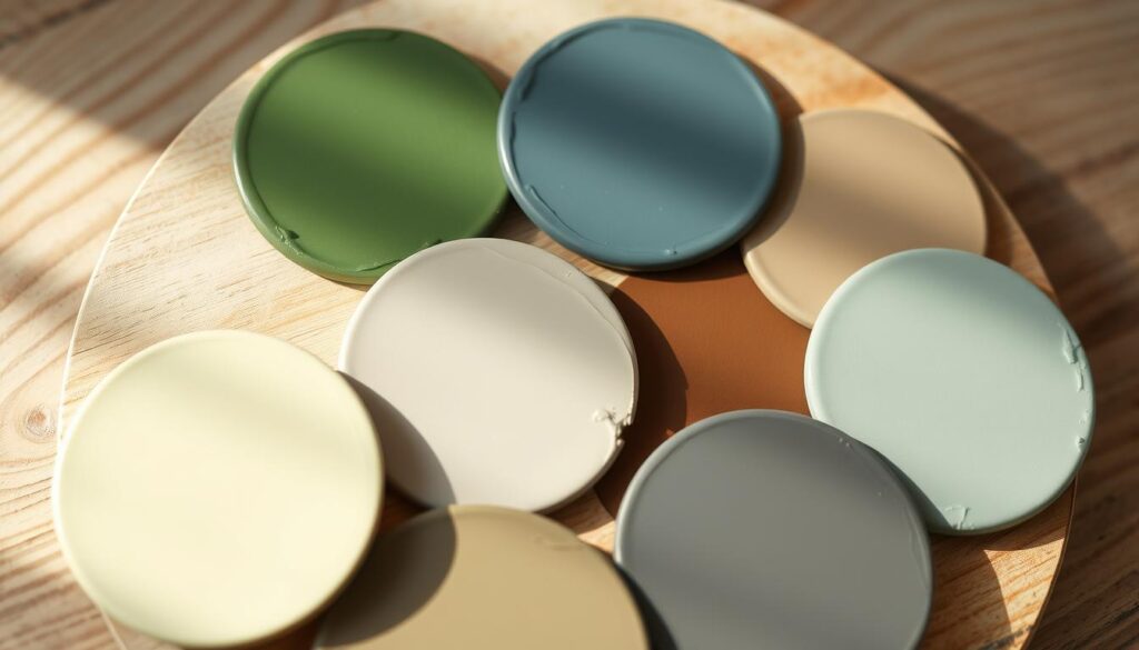
Eco-Friendly Choices for 2025
In 2025, there are many eco-friendly paint options. These choices meet different tastes and needs. Some key options include:
- Low-VOC (Volatile Organic Compound) paints that reduce indoor air pollution.
- Zero-VOC paints that have no harmful chemicals.
- Natural paints made from clay, lime, and plant dyes.
- Recycled paints that use old materials, cutting down on waste.
These paints are better for our health and offer many colors and finishes. This makes it easy for homeowners to find the look they want.
Experts say, “The future of interior design is green, and sustainable paint options are leading the way.”
Comparing Sustainable Brands
Choosing sustainable paint means looking at top brands. These brands focus on being eco-friendly and high-quality. Some of the best brands are:
| Brand | Key Features | Price Range |
|---|---|---|
| Brand A | Low-VOC, natural ingredients | $30-$50 per gallon |
| Brand B | Zero-VOC, wide color range | $40-$60 per gallon |
| Brand C | Recycled materials, durable finish | $25-$40 per gallon |
By comparing these brands, homeowners can find the best value for their money and the planet.
In conclusion, sustainable paint is more than a trend. It’s a big change in the interior design world. As we look to the future, eco-friendly choices will keep shaping our homes.
The Revival of Retro Colors
In 2025, retro colors are back in a big way, changing how we design our homes. This trend is inspired by mid-century modern styles, making today’s color schemes fresh and new.
This trend isn’t just about looking back. It’s about mixing old and new in a cool way. Trendy home decor colors now blend the past with today’s styles, making spaces both nostalgic and modern.
Mid-Century Modern Inspiration
Mid-century modern design focuses on being simple, functional, and connected to nature. These ideas are seen in the upcoming interior design hues for 2025. Expect to see earthy tones, rich wood, and bold colors.
Some standout colors from this era include:
- Warm beiges and taupes
- Rich turquoises and blues
- Deep yellows and oranges
Modern Takes on Classic Color Schemes
Retro colors are back, but they’re used in new ways. Designers are adding a modern twist to classic colors, creating a contemporary home color palette that’s both old and new.
For instance, a classic color like burnt orange might be matched with a modern neutral like soft gray. This creates a bold and interesting contrast.
By mixing retro colors with today’s design, homes can show off a unique and stylish vibe. This reflects the homeowner’s personality in a big way.
How to Choose the Right Color for Your Style
Choosing the perfect color for your home is a personal choice. It shows your style and what you like. As we look at home interior color trends 2025, picking colors that match your taste is key.
Knowing your personal style is important for picking home colors. Elle Decor says the right color choice depends on your preferences and the feel you want in your home.
Understanding Your Personal Aesthetic
To find colors that fit your style, think about these:
- Your favorite colors and how they make you feel
- The natural lighting in your home
- The architectural style of your home
- The colors of your furniture and decor
These factors help narrow down your color choices to match your taste.
Hiring Professionals vs. DIY
After picking colors you like, decide if you’ll hire a pro or do it yourself. Here are some things to think about:
| Aspect | Hiring Professionals | DIY |
|---|---|---|
| Expertise | Professionals know how to pick and apply colors well. | Doing it yourself can save money but takes research and effort. |
| Cost | Hiring pros is pricey but ensures quality. | DIY can be cheaper if you’re skilled. |
| Time | Professionals work fast and efficiently. | DIY takes longer, mainly if you’re new to painting. |
As
“The right color can transform a space, making it feel more welcoming and personalized.”
Whether to hire pros or DIY depends on your budget, time, and confidence in your skills.
By knowing your style and weighing the pros and cons, you can choose wisely. This leads to a beautiful and harmonious color scheme for your home.
Forecasting Future Trends Beyond 2025
Looking ahead, we see a shift in interior color trends for 2025. New colors and palettes are on the horizon. The interior design world is set to welcome fresh perspectives in 2026.
Emerging Colors for 2026
Experts predict a move towards sustainable and nature-inspired colors in homes. Shades like terracotta and sienna are expected to become popular. They bring warmth and coziness to our living spaces.
Navigating Design Changes
Staying updated on design trends is crucial. Knowing the colors of 2026 helps us design stylish, modern spaces. Let’s embrace these changes to create homes that are both beautiful and forward-thinking.

