Did you know the right paint color schemes can boost a home’s value by up to 5%? The right home color combinations interior can change how we feel in our homes. It can make our living spaces look better and feel more welcoming.
We’ll look at different interior color combinations like sage green and taupe, blue and burgundy, and pastel on pastel. These are popular in the 2025 home interior color trends. These paint color schemes can make any space feel more inviting and stunning.
Key Takeaways
- Discover the latest trends in interior color combinations.
- Learn how to choose the perfect paint color schemes for your home.
- Explore unique color combinations that can transform your living space.
- Understand the impact of color on the ambiance and value of your home.
- Get inspiration from the latest interior design trends.
Understanding the Psychology of Colors
Colors have a big impact on how we feel at home. They can change our mood, energy, and even what we eat. By picking the right colors, we can make spaces that help us relax, talk more, or work better.
How Colors Affect Mood
Colors make us feel different things. For example, blues are often seen as the most calming color for living rooms. They make us feel calm and peaceful. On the other hand, reds and oranges make us feel more energetic and excited. They’re great for places where we want to be active and social.
“Colors like green are soothing and pair well with neutrals,” a principle that can be observed in nature and effectively applied to interior design.
Green is known for balancing our emotions, lowering stress and anxiety. That’s why many people pick green for their living rooms or bedrooms. It helps create a calm atmosphere.
The Importance of Color in Design
Color is very important in interior design. It can change how we see a room. The right colors can make a room look bigger, cozier, or more welcoming. For those wanting to explore stunning interior home styles, knowing about color psychology is essential.
| Color | Emotional Effect | Best Used In |
|---|---|---|
| Blue | Relaxing, Calming | Living Rooms, Bedrooms |
| Red | Energizing, Stimulating | Dining Rooms, Gyms |
| Green | Balancing, Soothing | Living Rooms, Offices |
Knowing the psychology of colors helps us make better choices for our homes. Whether we want a calm place to relax or a lively space to work, the right colors are key.
Timeless Neutral Color Palettes
Neutral color palettes are a timeless choice in home decor. They offer elegance that never fades. These schemes fit many decorating styles, perfect for those who want sophistication without following trends.
Neutral colors create a calm and serene atmosphere. They help make a peaceful space that encourages relaxation.
Shades of Gray and Beige
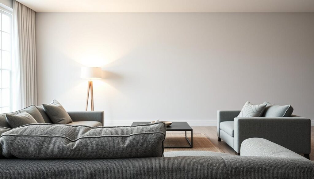
Gray and beige are key in many neutral palettes. They blend well, offering a modern yet classic look.
For instance, light gray walls paired with beige furniture and accents make a living room elegant and soothing. Adding textures like velvet or linen can make the space more interesting.
Adding Warmth with Earth Tones
Neutral palettes often include cool tones like gray and beige. But adding earth tones brings warmth and depth. Colors like terracotta, sienna, and umber add coziness and comfort.
To add earth tones, use throw pillows, rugs, or vases in these warm hues. This creates a balanced, inviting look.
| Color | Shade | Usage |
|---|---|---|
| Gray | Light | Walls |
| Beige | Soft | Furniture |
| Terracotta | Warm | Accents |
Mixing neutral colors and earth tones creates a unique, inviting space. It shows off your personal style.
Vibrant Accent Colors to Consider
Adding vibrant accent colors can make your home interiors pop. These colors add depth and interest. They can also change the look of a room and leave a lasting impression.
You can use accent colors in many ways. Try them in furniture, rugs, throw pillows, and wall decor. The trick is to balance them with the main colors to avoid too much.
Bold Reds and Oranges
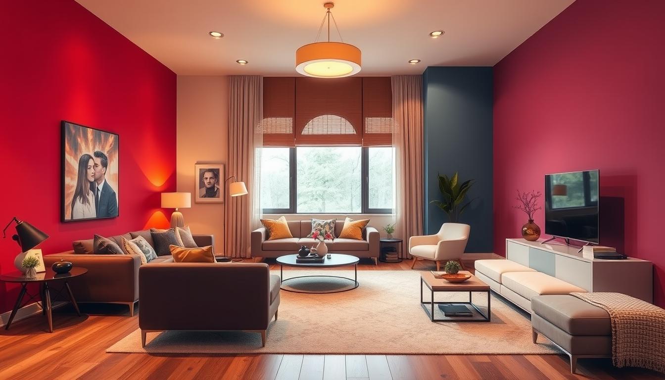
Bold reds and oranges are great for adding a lively feel. They make rooms cozy and welcoming, perfect for living and dining areas. For example, a bold red wall can stand out against neutral furniture.
Check out Benjamin Moore’s living room inspiration page for more ideas.
- Reds can spark conversations and energy, great for social spots.
- Oranges bring a fun and youthful feel to any room.
- Using bold reds and oranges wisely keeps the space from feeling too much.
Adding Depth with Blues and Greens
Blues and greens bring calm and serenity to your home. They’re ideal for bedrooms and bathrooms, where you want to relax. Blues can be light and airy or deep and rich. Greens range from fresh mint to deep forest.
- Light blues can make a room feel bigger and more open.
- Deep greens bring nature inside, creating a peaceful vibe.
- Blues and greens together create a soothing and balanced color scheme.
When using vibrant accent colors, think about your home’s overall look and style. This way, you can achieve a look that shows off your personal taste and style.
Harmonious Monochromatic Schemes
A monochromatic scheme can make any room feel more harmonious. It uses different shades of one color to create unity. This makes spaces feel bigger and more connected.
Creating a Cohesive Look
Choosing the right color is key for a monochromatic scheme. Soft colors like pale blue can be calming. Deeper tones, like navy blue, add drama and sophistication.
Key considerations for a cohesive monochromatic look include:
- Choosing a core color that aligns with your design goals
- Exploring different shades and tints of the chosen color
- Balancing lighter and darker shades to create visual interest
- Incorporating various textures to add depth

Best Practices for Monochromatic Spaces
Creating a monochromatic design needs careful planning. Here are some tips for a vibrant space:
- Layering Colors: Use different layers of the same color to create depth. This can include walls, furniture, and accessories.
- Texture Variation: Incorporate a variety of textures to add visual interest. This can range from smooth surfaces like glass to rough textures like woven baskets.
- Accent with Neutrals: Sometimes, adding a neutral accent can enhance the monochromatic scheme by providing a subtle contrast.
| Design Element | Monochromatic Application | Benefit |
|---|---|---|
| Color | Using different shades of a single color | Creates harmony and cohesion |
| Texture | Incorporating various textures | Adds depth and visual interest |
| Accent | Adding neutral accents | Provides subtle contrast |
By following these strategies, you can make a monochromatic space that looks great and feels personal. It will enhance your home’s atmosphere.
Trending Color Combinations for 2024
As we enter 2024, interior design is buzzing with new color combos. These promise to change our homes. We’re seeing a big move towards colors that show our personality and make our homes feel right.
“The right color palette can completely change the feel of a room,” says design expert. “In 2024, we’re embracing colors that bring both elegance and warmth to our living spaces.”
Pastel Palettes for Soft Elegance
Pastel colors are back in 2024, bringing soft elegance to our homes. Hues like pale pink, baby blue, and mint green make rooms feel calm. They’re great for bedrooms and living rooms.
To add pastel colors to your home, mix them with neutral shades like beige or gray. This mix adds elegance while keeping things calm.
Jewel Tones for a Luxurious Feel
For a bolder look, jewel tones are in for 2024. Colors like emerald green, sapphire blue, and ruby red make rooms feel luxurious. You can use them as accents or the main color.
To balance bold jewel tones, add metallic accents like gold or silver. This mix makes the space feel sophisticated and glamorous.
Exploring these color trends shows 2024 is about trying new palettes. Whether you choose soft pastels or bold jewel tones, the goal is to have fun and show your style through color.
Mixing Patterns and Textures
Mixing different patterns and textures adds depth and character to your home. It can turn a simple space into a lively and welcoming place.
When mixing, pairing color with pattern is key. Choose patterns that match in design and color. For example, a bold rug with a subtle sofa creates a nice contrast.
Pairing Color with Pattern
To pair color with pattern well, follow these tips:
- Match patterns by color for cohesion.
- Use different pattern scales for interest.
- Balance bold patterns with neutral backgrounds.
For instance, a bright floral with a calm stripe pattern works well. They share a color, making the space balanced and interesting.
Adding Texture for Visual Interest
Adding texture also boosts your space’s look. Texture makes decor more engaging and tactile.
Ways to add texture include:
- Throw blankets and pillows in various textures.
- Rugs with different heights for depth.
- Vases, baskets, or sculptures for contrasting textures.
Mixing patterns and textures thoughtfully makes your home rich and inviting. The goal is to balance elements to avoid overwhelming the space.
For the best color pairings and to choose colors for your house, explore color theory and interior design resources.
Color Combinations for Small Spaces
In small spaces, color choices are key. The right colors can make a room feel bigger, cozier, or more open than it is.
When decorating small areas, think about how colors work together. Light colors are great for making rooms look bigger.
Light Colors to Create Illusion of Space
Light colors on walls, ceilings, and floors reflect light well. This makes rooms feel more open. White, cream, and pale gray are top picks for small spaces.
For example, soft gray walls with white trim and pale hardwood floors look seamless and expansive. Mirrors also help by reflecting light and images, making spaces feel larger.
Dark Accents for Contrast
Light colors make rooms feel bigger, but dark accents add depth. Darker shades on furniture, rugs, or decor create a cozy feel and highlight certain areas.
In a small room with light gray walls, dark blue or navy on a statement piece or accent wall stands out. This adds interest and defines areas.
Finding the right mix of light and dark is key. Too much darkness can feel cramped, while too much light can feel cold.
Outdoor-Inspired Color Themes
Nature has always inspired designers. Outdoor-inspired color themes bring the outdoors inside. This makes our homes feel more connected to nature.
Bringing Nature Indoors
To bring nature inside, we look at the outdoors for color inspiration. Earthy tones like greens, browns, and tans calm us down. They remind us of forests or fields.
Using natural materials and textures with these colors enhances the theme. Wood accents or stone features add depth and warmth to a room.
Choosing Paints for Outdoor Vibes
When picking paints for an outdoor feel, think of the sky, foliage, and earth. Soft blues and whites mimic the sky. Various greens bring in foliage freshness.
For a bold look, try deeper, richer colors like terracotta or sienna. They add warmth and coziness to a room.
| Color Inspiration | Paint Color | Room Effect |
|---|---|---|
| Sky Blues | Soft Blue | Calming, Airy |
| Foliage Greens | Mint Green | Fresh, Natural |
| Earth Tones | Terracotta | Warm, Cozy |

By using outdoor-inspired colors in our homes, we make them beautiful and connected to nature. Earthy tones, natural materials, and nature-inspired paints open up endless possibilities.
Conclusion: Finding Your Perfect Color Combination
Choosing the right color scheme can change your home. Think about the mood and atmosphere you want in each room. This will help you pick the best home color combinations.
Use design tips for interior colors to make a good choice. First, decide what the room is for and the feelings you want it to have. Then, try out different color combinations. Remember to think about the room’s natural light and furniture too.
Practical Tips for Choosing Colors
Start with a neutral base color and add accent colors for interest. Color wheels and design trends can also inspire you. They offer great guidance for your color choices.
Resources for Further Inspiration
For more ideas, check out design blogs, social media, and home decor magazines. Some brands have tools like color palette generators. These can help you see your ideas come to life.


