Did you know the right color palette can boost your home’s value by up to 5%? Picking the perfect interior color combination is key for homeowners wanting to improve their home’s style and appeal. With so many choices, finding the right colors can be tough.
Our team has picked the best color combinations to make your home look amazing. Whether you want to update one room or your whole house, our guide has you covered. We’ll show you the most effective and beautiful options.
Understanding the role of color in home design is crucial. It helps create a welcoming and harmonious space. Our article will dive into the importance of color and how to avoid common mistakes.
Key Takeaways
- Discover the top interior color combinations that boost your home’s style.
- Learn how to choose the perfect color palette for your living space.
- Understand the importance of color in home design.
- Avoid common color mistakes that can decrease your home’s appeal.
- Get expert tips on creating a harmonious and inviting atmosphere.
Understanding the Importance of Color in Home Design
Colors can change how we see and feel in our homes. Choosing the right colors is key to making our homes welcoming or not.
When designing our homes, we must think about how colors work together. A good interior design color palette can make a room look better and work better too.
How Color Impacts Mood and Atmosphere
Colors can make us feel different emotions. Warm colors like red and orange make us feel cozy. Cool colors like blue and green help us relax.
“Color is a power which directly influences the soul. Color is the keyboard, the eyes are the hammers, the soul is the piano with many strings. The artist is the hand that plays, touching one key or another, to cause vibrations in the soul.” – Wassily Kandinsky
Knowing how colors make us feel is important. It helps us choose a home interior color scheme that shows who we are and meets our needs.
| Color | Mood/Atmosphere |
|---|---|
| Red | Energy, Passion |
| Blue | Calmness, Serenity |
| Green | Nature, Harmony |
The Psychology of Color Choices
The psychology of color is complex. It’s shaped by our experiences, culture, and what we like. It’s not just about picking colors we like. It’s about how they will work in the space and affect us.
A study showed that colors can change how we feel about temperature. Warm-colored rooms feel warmer than cool-colored rooms at the same temperature.
By choosing colors based on their effects, we can make a space that is both beautiful and functional. This can improve our well-being.
Popular Color Trends for2023
As we enter 2023, interior design is buzzing with new color trends. These colors aim to refresh our homes. They reflect our personalities, our love for nature, and our quest for calm.
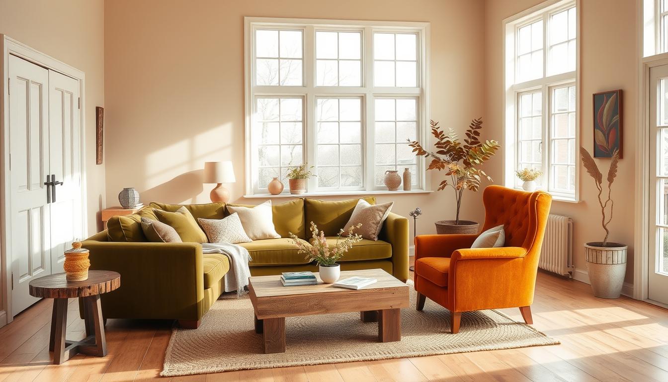
Earthy Tones: Embracing Nature Indoors
Earthy tones are still a big hit in home decor. They bring warmth and elegance. Colors like terracotta, sienna, and moss green are favorites. They make us feel like we’re outdoors.
To incorporate earthy tones into your home:
- Use terracotta pots and natural fiber rugs to add warmth.
- Opt for wooden furniture with a natural finish.
- Bring in plants with varying shades of green to enhance the earthy ambiance.
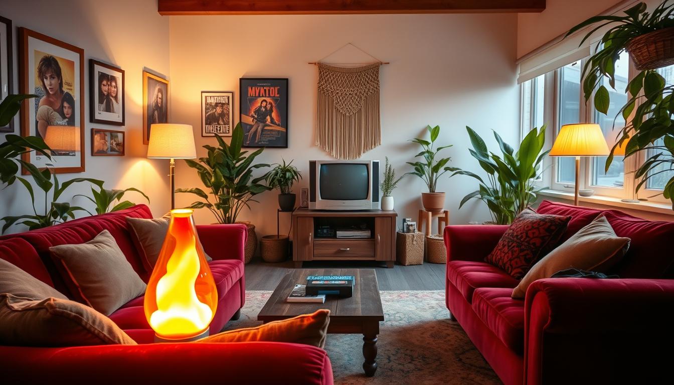
Bold Jewel Tones: Making a Statement
For a bold look, try jewel tones. Rich blues, emerald greens, and sapphires add luxury. They can make any room stand out.
“Jewel tones add depth and sophistication,” say design experts. “They’re great as accent colors.”
To incorporate bold jewel tones, consider using them in:
- Accent walls or furniture.
- Decorative accessories like vases or throw pillows.
- Statement lighting fixtures.
Soft Pastels: Creating a Tranquil Space
Soft pastels offer a calm alternative. They create a peaceful atmosphere. Perfect for bedrooms and bathrooms, where we want to relax.
To effectively use soft pastels:
- Pair pastel shades with neutral tones to avoid overwhelming the space.
- Use pastel-colored glassware or ceramics as decorative elements.
- Consider pastel-hued walls for a calming backdrop.
In conclusion, 2023’s color trends cater to all tastes. Whether you love nature or bold statements, these colors can make your home stylish and personal.
Classic Color Combinations That Never Go Out of Style
In the world of interior design, some classic color combinations are always in style. These timeless house color combinations are loved for their elegance and versatility. They add sophistication to any home.
Navy Blue and White: Timeless Elegance
The mix of navy blue and white is a classic choice. It brings timeless elegance to any room. This pair works in many design styles, from traditional to modern.
The contrast between navy blue and white is striking. It’s perfect for:
- Accent walls and furniture
- Decorative accessories and textiles
- Kitchen cabinets and island
For more color inspiration, check out our article on breathtaking interior color combinations to transform your home.
Grey and Yellow: A Bright, Cheerful Mix
Grey and yellow is another classic combo. It brings a bright and cheerful vibe to any space. The grey balances the yellow, making a harmonious palette.
This mix is great in:
- Living rooms, where it can stimulate conversation
- Kitchens, where it can add warmth and energy
- Bedrooms, where softer shades can promote relaxation
Using these classic color combinations in your decor makes your home stylish and lasting.
Incorporating Neutrals into Your Color Palette
Adding neutral shades to your home’s color scheme is smart. It gives you a sophisticated look that lasts. These colors are great because they match well with bold colors, perfect for changing your decor often.
Shades of Beige: Versatile and Warm
Beige is a classic that adds warmth and coziness. It fits both modern and traditional styles, making it a versatile option. Mixing different beige shades can add depth and interest to your space.
Beige comes in many shades, from soft cream to taupe. Mixing them can create a unique look. For example, a light beige with a deeper taupe can add contrast and character.
Combining Gray and White for a Sophisticated Look
Gray and white together are elegant and sophisticated. This combo is great for creating a calm atmosphere, perfect for bedrooms and bathrooms. The trick is to balance gray and white well.
Using gray as the main color and white as an accent can be soothing. On the other hand, white as the main color with gray accents can make a room feel brighter. This flexibility makes it a favorite among those seeking trendy interior paint colors.
Whether you want a bold statement or a subtle look, neutrals are a solid base. By mixing shades like beige, gray, and white, you can create a welcoming home.
Color Combinations for Different Rooms
Choosing the right colors for each room is key to a harmonious home. Different rooms have different uses, and the right colors can change how they feel and work.
Living Room: Warm and Inviting Hues
The living room is where family and friends come together. Warm and inviting hues make it cozy and welcoming. Try earthy tones like terracotta, sienna, or sandy beige for a comforting feel.
For a modern look, add deep blues or greens. They bring depth and sophistication to the room.
Kitchen: Bright and Fresh Palettes
The kitchen is important for a good color scheme. Bright and fresh palettes make it feel lively and clean. Whites, creams, and soft pastels are great because they reflect light and open up the space.
For a bold look, try vibrant colors like red or yellow. They can make you hungry and spark conversations.
Bedroom: Calm and Restorative Tones
The bedroom is your retreat for rest and relaxation. Calm and restorative tones are crucial for a peaceful space. Soft blues, mauves, and pale greens help you relax.
For a luxurious feel, consider rich jewel tones like emerald green or sapphire blue. They add a touch of luxury to the room.
By picking the right colors for each room, you can make your home beautiful and functional. Whether you want modern interior color ideas or classic looks, find a balance that suits your style and the room’s purpose.
Using Accent Colors to Enhance Your Décor
Accent colors can make your home’s interior design pop. They add a personal touch and create interest. You use them to highlight certain areas or features in a room.
What is an Accent Color?
An accent color is a bold or vibrant hue used in small amounts. It adds contrast and makes a room’s focal point. You can use it in throw pillows, rugs, vases, or wall art.
When picking an accent color, think about the mood you want. A bold red can energize a space, while a soft blue can calm it.
Best Accent Colors to Pair with Neutrals
Neutral backgrounds are perfect for accent colors. Here are some great options:
- Corals and Salmons: These warm colors go well with beige and cream, adding warmth.
- Deep Blues: A rich blue accent looks sophisticated with gray or white neutrals.
- Emerald Green: Emerald green makes a bold statement with beige or off-white neutrals.
- Mustard Yellow: This vibrant color adds a pop to neutral spaces, used in moderation.
Remember to balance accent colors with your neutral palette. This prevents the space from feeling too busy.

Choosing and using accent colors thoughtfully can really enhance your home’s décor. It makes your space unique and personalized.
The Role of Lighting in Color Perception
Understanding how lighting affects color perception is key for picking the right home interior color schemes. The right lighting can change how colors look in your home. It’s crucial for creating the right mood.
Natural Light vs. Artificial Light Effects
Natural light and artificial light change color perception differently. Natural light shows colors as they truly are, covering the full light spectrum. But, natural light’s intensity and color can change during the day.
Artificial light offers consistent color but might miss some color details that natural light catches.
Artificial lighting includes LED, incandescent, and fluorescent types. Each has its own color and how it shows colors. For example, LED lights are energy-saving and can look like natural daylight. Incandescent bulbs give off a warmer, yellower light.
Choosing Paint Finishes for Optimal Appearance
The paint finish affects how colors look under different lights. A matte finish reduces glare and works well in bright areas. A satin or gloss finish adds depth and vibrancy, making colors pop under artificial light.
Think about the room’s lighting when picking a paint finish. A matte finish is good for bright rooms. For rooms with artificial light or where you want to highlight features, satin or gloss is better.
Popular Color Combinations by Style
Different styles in interior design need their own color palettes. The right colors can change a room’s feel and look. It’s key to pick colors that match your design style.
Sleek and Minimalist
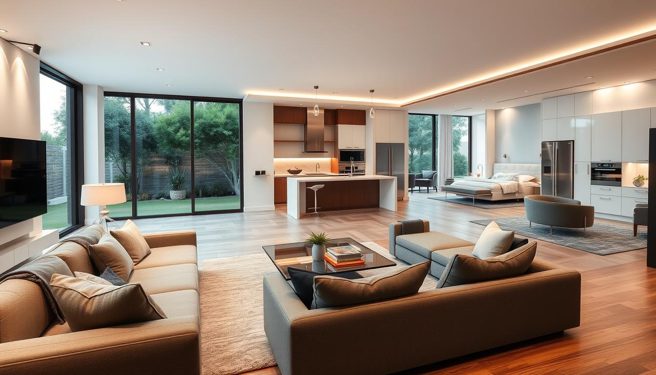
Modern design is all about being sleek and simple. Use white, gray, and taupe to create a clean look. These colors let your furniture and decor stand out.
In a modern living room, soft grays and creamy whites work well together. They make the space feel calm and welcoming. Add a bold color with throw pillows or art, like deep blue or rich green.

Warm Undertones and Natural Shades
Rustic design focuses on warmth and coziness. Use earthy tones like terracotta, sienna, and olive green. These colors make a space feel welcoming and comfy.
In a rustic kitchen, mix warm wood with earthy reds and greens. This creates a cozy feel, great for family homes. Adding stone and brick brings texture and depth.
| Style | Color Palette | Key Elements |
|---|---|---|
| Modern | Soft grays, creamy whites, deep blues | Minimal decor, sleek lines, monochromatic scheme |
| Rustic | Terracotta, sienna, olive green | Natural materials, earthy tones, warm lighting |
For more ideas on updating classic designs, see our tips on reviving the 1970 home interior. It shows how to adapt styles and colors to your home’s unique vibe.
DIY Tips for Choosing Your Color Scheme
Choosing a color scheme can be overwhelming. Our DIY tips will help you through it. The right colors can change how your home feels and looks.
Using Color Swatches: Tried and True Methods
Color swatches are a great way to pick a color scheme. They let you see how colors will look in your home. Remember, the natural lighting in your rooms affects color appearance.
Start by picking color swatches that match the trendy interior paint colors you like. Place them against furniture and flooring to see how they look together.
Testing with Samples: Making Informed Decisions
Once you’ve picked colors with swatches, test them on your walls. This step is key because it shows how colors look on a bigger scale.
Paint samples on different walls and watch them at different times of day. This helps you see how colors change with light. It helps you choose the best colors for your home interiors wisely.
Follow these DIY tips to pick a color scheme that shows your style and makes your home look better. Remember, finding the right colors is about balance and harmony. So, don’t be shy to try different combinations until you find the perfect one.
Avoiding Common Color Mistakes
Choosing the right color scheme for your home is key. It helps create a beautiful and harmonious space. Many homeowners struggle to achieve this because of a few color mistakes.
Overusing Bold Colors: Finding Balance
Using too many bold colors is a common error. A bold color can add character, but too much can overwhelm. Use bold colors as accents to balance your space. For example, a vibrant red can be used for a statement piece or an accent wall, not the whole room.
Ignoring Flow: Creating Cohesion Throughout Spaces
Ignoring color flow in your home is another mistake. A cohesive color scheme creates continuity and makes your home feel bigger. Choose a few core colors and use them in different rooms. This way, each room connects visually without being identical.
For an open-plan living area, pick colors that complement each other. This creates a smooth transition between spaces. It makes your home look modern, cohesive, and welcoming.
Resources for Color Inspiration
Finding the right colors for your home can be tough. But, with the right tools, it’s easier. Check out online tools and apps for different color palettes and paint trends.
Digital Tools for Color Exploration
Websites like Houzz and apps like Color Hunt have lots of colors and palettes. They help you find the perfect colors for your home. You can save your favorites and pick the best scheme.
Home Decor Magazines and Websites
Home decor magazines and websites also offer great inspiration. Architectural Digest and Better Homes and Gardens show the latest color trends. They give tips on using these colors in your home.