Did you know that the colors in your contemporary home design can affect your mood and productivity? Picking the right colors is more than just a personal choice. It’s about making a space that boosts your well-being. At Homestylista, we know how crucial it is to get it right.
Choosing the right modern home interior colors means knowing the latest trends and color psychology. We’ll guide you through picking the perfect colors for your home.
Key Takeaways
- Understand the psychology behind different color choices.
- Explore the latest trends in contemporary home design colors.
- Learn practical tips for applying color in your space.
- Discover how to create a cohesive color scheme.
- Get inspiration from our top interior color combinations.
Understanding Modern Home Interior Colors
Learning about modern home interior colors can change your living space. These colors are simple, elegant, and make rooms feel bigger. They’re not just for looks; they also make your home feel welcoming and comfy.
What Defines Modern Colors?
Modern colors have clean lines and minimalism. Neutrals like whites, grays, and beiges are favorites for their calm vibe. You can add bold accents to make a room pop.
- Soft pastels for elegance
- Deep jewel tones for luxury
- Earth tones for warmth
Together, these elements make a modern color scheme that’s both trendy and timeless. The trick is to balance colors and textures to keep things interesting.
The Impact of Color Psychology
Color psychology is key in interior design. Different colors can make us feel different ways. For example, blue is calming, and red is energizing. Knowing this can help you pick colors that feel right for your home.
Some trends include relaxing colors in bedrooms and energizing colors in workspaces. Thinking about color psychology helps you make spaces that look good and feel good too.
When looking for modern color inspiration, think about how colors look and feel. This way, your home will be beautiful and show off your personality.
Popular Modern Color Trends for 2023
Modern home colors are changing in 2023. Trends now favor both soft and bold colors. This year, we see a mix of comfort and style, making homes inviting and eye-catching.
Earthy Tones and Neutrals
Earthy tones and neutrals are back in 2023. They add warmth and coziness to homes. Colors like terracotta, sienna, and umber pair well with neutrals like beige and gray.
These colors are great because they match many decorating styles. They’re perfect for creating a calm bedroom or a cozy living room.
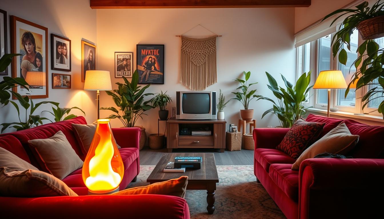
Bold Accents and Jewel Tones
2023 also brings bold accents and jewel tones. These vibrant colors add depth and personality to homes. Deep blues and emerald greens are among the best modern color schemes.
Jewel tones add luxury and sophistication. They can be used in furniture, decor, or accent walls. When used right, they make a room stand out.
It’s key to balance bold colors with neutrals. This way, we avoid overwhelming the space. By doing this, we create stylish and harmonious interiors that showcase the best modern color schemes of 2023.
Creating Harmony with Color Palettes
Creating a cohesive look in your home is more than picking your favorite colors. It’s about making a color palette that shows your style and fits your space’s architecture.
Choosing trendy home décor colors can be hard. But knowing about color harmony helps you pick colors that look good together and make your home beautiful.
Complementary Colors for Balance
Using complementary colors is a great way to balance your home’s look. These colors are opposite each other on the color wheel. They create a striking contrast that adds interest to any room.
For example, blue and orange or red and green make a room lively. But, use these colors wisely. Mix bold colors with neutral ones to avoid too much.
| Color | Complementary Color | Effect |
|---|---|---|
| Blue | Orange | Vibrant Contrast |
| Red | Green | Dynamic Balance |
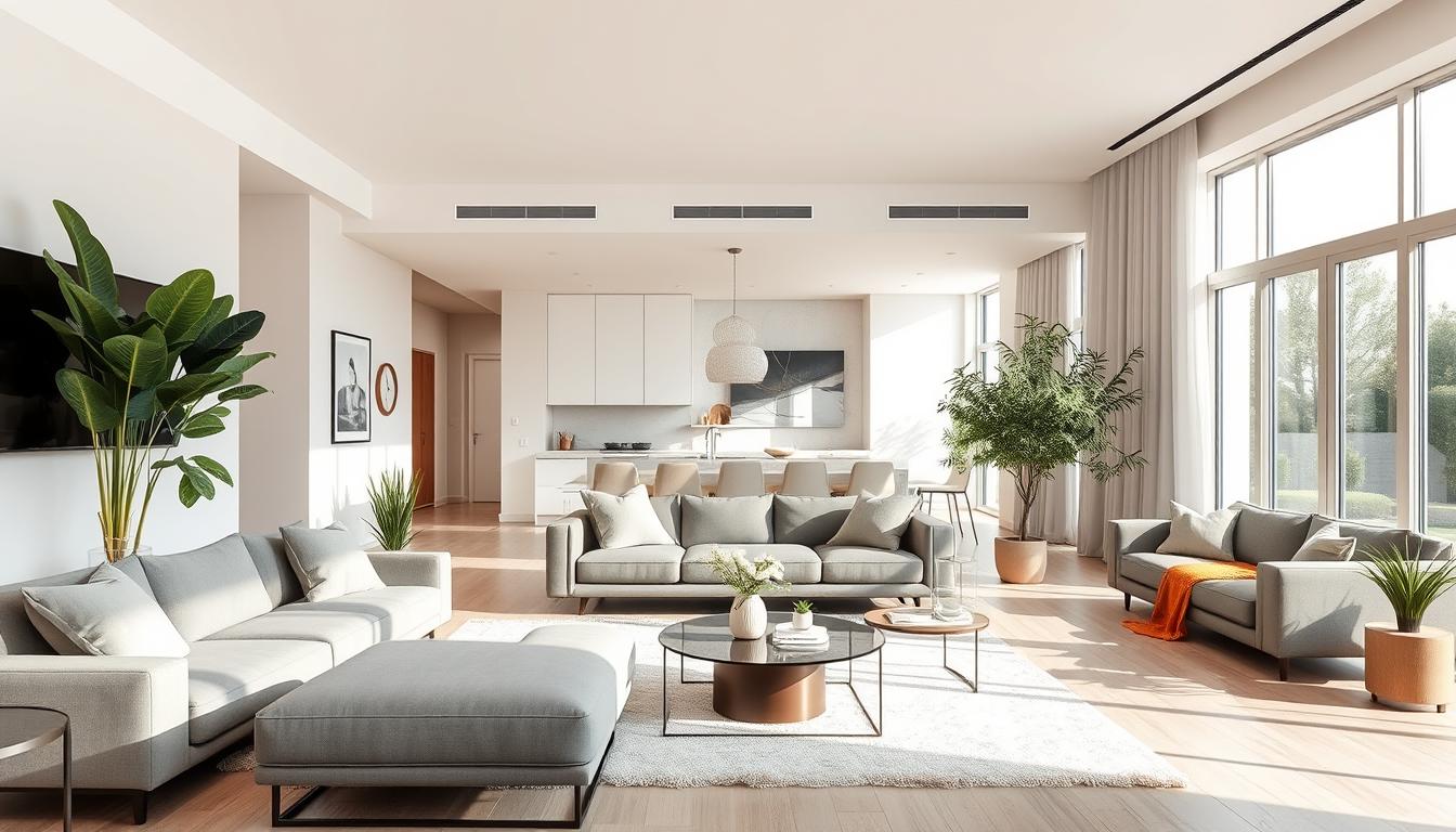
Monochromatic Schemes
Try a monochromatic color scheme for a softer look. This means using different shades of the same color. It makes your space look bigger and more harmonious.
To make a monochromatic scheme pop, add different textures and tones. For example, using various shades of gray can look great with metallic or natural textures like wood or stone.
For more ideas on stunning color combinations, check out Homestylista. They offer expert tips and beautiful examples.
The Role of Lighting in Color Selection
Lighting greatly affects how we see colors in our homes. It’s key to know how it changes color perception when picking modern home interior colors.
Lighting does more than just help us see. It also sets the mood and highlights your fresh home color ideas. The right lighting can make your colors pop, while the wrong one can dull them.
Natural vs. Artificial Light
Natural light shows colors as they truly are, with a full spectrum. But, its intensity and color can change with the day and your windows’ direction.
Artificial light, like incandescent, fluorescent, and LED, has its own color and brightness. This can change how we see colors.
| Lighting Type | Color Temperature | Effect on Colors |
|---|---|---|
| Natural Light | Variable | Accurate color representation |
| Incandescent | Warm | Enhances warm colors, may distort cool colors |
| LED | Cool to Warm | Can enhance a wide range of colors depending on temperature |
How Lighting Affects Color Perception
Lighting’s impact on color perception is complex. Colors look different under different lights. Knowing this helps when picking modern home interior colors.
“The right lighting can make your home’s colors come alive, while the wrong lighting can make them fall flat.”
To make sure your colors look great, try these tips:
- Test your colors at different times and under various lights.
- Use different light sources for a layered look.
- Think about your lighting’s color temperature and how it will mix with your colors.
Understanding lighting’s role in color choice helps create a welcoming home. Your chosen colors will shine in the best light.
Consideration of Space Size and Layout
Choosing the right colors for your home interior is all about the space’s size and layout. The dimensions and setup of your living area greatly affect how colors look. It’s key to pick colors that match your space well.
Small Spaces: Light vs. Dark Colors
In small spaces, light and dark colors play a big role in how big the area seems. Light colors make a room look bigger by bouncing more light around. On the other hand, dark colors can make a space feel cozy but smaller.
Think about the natural light in your space. If it’s bright, you can use darker shades without making it feel too small. But if it’s dim, lighter colors can brighten it up.
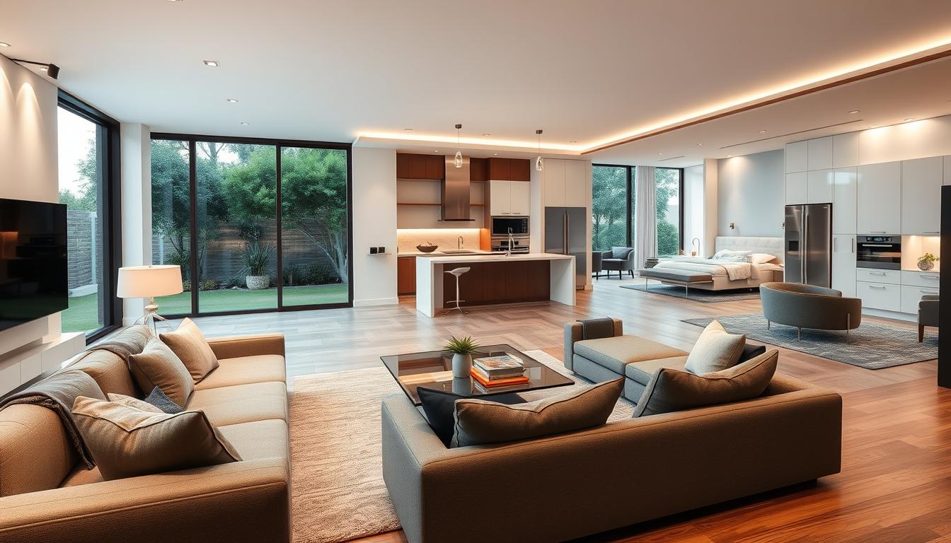
Open Floor Plans: Color Flow
For homes with open floor plans, keeping a color flow is key. A consistent color scheme helps define different areas without breaking the flow.
Start with a main color and use its different shades and tones throughout. This creates a smooth visual flow. Also, using the same color for trim and ceilings helps keep the look continuous.
| Color Strategy | Description | Effect |
|---|---|---|
| Monochromatic | Using different shades of the same color | Creates a cohesive look |
| Complementary | Pairing colors opposite each other on the color wheel | Produces a vibrant and dynamic atmosphere |
| Analogous | Using colors next to each other on the color wheel | Results in a harmonious and soothing palette |
By thinking about your space’s size and layout, and using these color strategies, you can make your home look great. You’ll be following the latest trends in interior colors.
Choosing the Right Paint Finish
Understanding the different paint finishes is key to getting the look you want. It helps make your home’s interior both stylish and modern.
When picking a paint finish, think about each room’s needs. Finishes vary in durability and look.
Matte, Satin, and Gloss: What to Use
There are many paint finishes, each with its own traits and uses:
- Matte Finish: Great for areas that don’t get much use and ceilings. It’s flat and hides flaws well.
- Satin Finish: Has a slight shine, perfect for most rooms. It’s durable and easy to clean, unlike matte.
- Gloss Finish: Very shiny and tough, ideal for trim and doors. It’s easy to clean and lasts long.

Finish Impact on Overall Aesthetic
The paint finish greatly affects your home’s look. For example, a matte finish brings a calm vibe, while a gloss finish adds elegance.
Think about the style you want for your home. For a modern feel, satin or semi-gloss is best. They add a nice shine that fits well with modern decor.
Choosing the right paint finish can really boost your home’s style. It makes your interior design look cohesive and stylish.
Incorporating Textures and Patterns
Textures and patterns make our homes more interesting and modern. They add depth and visual interest. This makes our living spaces more engaging.
The texture of materials affects how we see colors. A matte finish can soften colors, while a glossy finish makes them pop. Understanding how texture changes color perception is key to a balanced interior.
Texture’s Influence on Color Choice
When picking colors, think about the textures of your materials. Different textures change how colors look. For example, velvety textures make colors richer, while stone textures give them a rugged feel.
To get a cohesive look, balance textures and colors. Choose a main texture and color, then add others to enhance the look.
Pattern Mixing for Modern Spaces
Mixing patterns adds visual interest to a room. Start with a main pattern and add secondary ones that complement it. Varying pattern scales is crucial for balance. For example, a large pattern with smaller ones creates a nice contrast.
When mixing patterns, keep colors consistent. Sticking to a color palette ties patterns together. A neutral background also helps balance bold patterns.
By carefully choosing textures and patterns, we can make our homes modern and stylish. Whether we prefer minimalism or eclecticism, textures and patterns can take our decor to the next level.
Personalizing Your Color Choices
Choosing the right colors for your home is key to making it feel like your own. It’s not just about following the latest trends. It’s about showing off your personality and style through color.

Reflecting Personal Style
To show your style through color, start by picking colors you love. Look at your clothes, art, and favorite decor. These can help you choose colors that make your home special.
For a chic look, think about using neutral colors like creamy whites, soft grays, or taupe. These colors are great because they let you add pops of color easily. This way, you can change up your space as trends evolve.
Key Considerations for Personalized Color Schemes:
- Find your favorite colors and see how they fit in your home.
- Think about how colors make you feel.
- Use color to set the mood in each room.
Seasonal Color Shifts
Changing your home’s colors with the seasons keeps it feeling fresh. Lighter colors can make your home bright and open in winter. Deeper colors add warmth and coziness.
| Season | Color Palette | Effect |
|---|---|---|
| Spring | Pastels, soft greens | Renewal, freshness |
| Summer | Bright whites, blues | Cooling, vibrant |
| Autumn | Warm oranges, yellows | Cozy, inviting |
| Winter | Deep blues, icy whites | Calm, serene |
By choosing colors that show your style and changing them with the seasons, you can make your home chic and personal. It will feel welcoming and truly yours.
Tips for Testing Colors Before Committing
Before you decide on a color for your modern home, it’s key to test it. We’ll show you how to use sample swatches and test areas. This way, you can make sure your color fits well with your home’s design.
Sample Swatches and Test Areas
Painting a small test area on your wall is a good idea. It lets you see how the color looks in different lights. Watch how it changes at morning, noon, and night to see its true effect.
Evaluating Colors at Different Times of Day
Colors can look different under different lights. Check your color in the morning, afternoon, and evening. This helps you see how it will look all day. It makes sure your color stays appealing and consistent, improving your home’s look.