Did you know that the colors in your living space can change how you feel? A good color scheme can make your home’s ambiance feel more inviting and calm.
Choosing the right color palette might seem hard, but it can be enjoyable. We’ll show you how to create a beautiful color scheme that shows off your style and fits your home’s architecture.
Key Takeaways
- Understand the importance of color theory in creating a harmonious color palette.
- Learn how to choose a base color that sets the tone for your space.
- Discover how to incorporate interior design color trends responsibly.
- Get tips on creating a color palette that complements your home’s architecture.
- Find out how to balance different colors to create a visually appealing space.
Understanding the Importance of a Color Palette
Colors are key in interior design, affecting both the look and feel of your home. A well-chosen color palette can make your living space more welcoming and cozy.
Why Color Matters in Interior Design
Color is vital in interior design, changing how we see a room. It can make a room seem bigger or smaller. It also affects the mood and actions of those inside.
For example, light colors can make a room feel open. Dark colors can make it feel snug and cozy. When decorating with color, think about the room’s purpose and how you want to feel there. Calming colors like blues and greens are great for bedrooms. Bright colors like oranges and yellows are perfect for kitchens to boost appetite and conversation.
The Psychological Effects of Colors
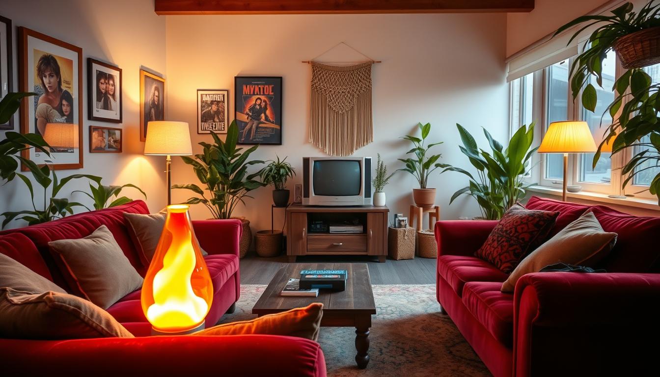
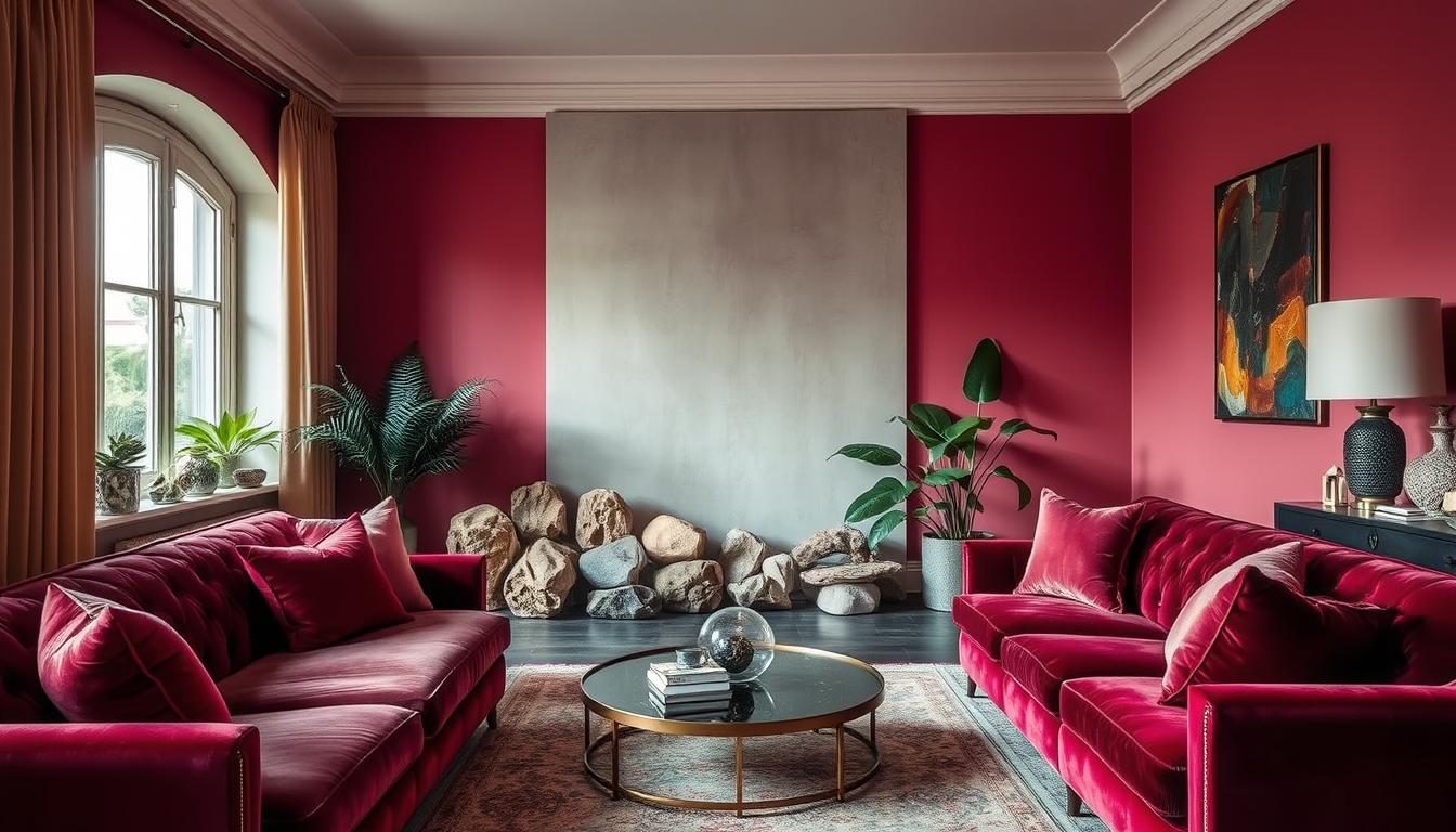
Colors deeply affect our emotions and mood. Knowing how different colors impact us can help create a palette that’s not just pretty but also good for our well-being. For instance, reds and oranges energize and stimulate, fitting well in active areas like living rooms and dining rooms.
Cooler colors like blues and purples bring calmness and peace, making them ideal for bedrooms and bathrooms. To learn more about stunning interior color combinations, check out our related article. It offers inspiration and guidance on choosing the perfect color palette for your home.
Identifying Your Personal Style
Understanding your personal style is key to picking the right room color combinations. These colors should show your taste and fit your lifestyle.
Your home’s design shows who you are. The colors you choose set the mood and feel of each room.
Exploring Different Design Styles
Interior design has many styles, from modern to traditional. Exploring these styles helps you find what you like best.
For example, modern fans might like clean lines and bold colors. Traditional lovers might prefer rich tones and classic patterns.
Reflecting on Our Preferences and Lifestyle
Choosing colors should reflect your likes and lifestyle. Think about how you use each room and the mood you want.
If you work from home, pick best interior paint colors for focus and calm. Big families might choose easy-to-clean colors.
By thinking about your needs and tastes, you can pick coordinating colors for home interiors. This makes your space better and shows your personality.
The Basics of Color Theory
Color theory is key for a color palette in your home. It’s a set of rules to make color combinations that look good. This can make any room look better.
Color theory is about how colors work together. It teaches us to use the color wheel to pick colors that match well.
Primary, Secondary, and Tertiary Colors
The color wheel has primary, secondary, and tertiary colors. Primary colors are red, blue, and yellow. You can’t make these colors by mixing others.
- Red is bold and energetic, great for living rooms and dining rooms.
- Blue is calming, perfect for bedrooms.
- Yellow is bright and cheerful, ideal for kitchens and playrooms.
Secondary colors come from mixing two primary colors. These are green (blue + yellow), orange (red + yellow), and purple (red + blue).
Tertiary colors mix a primary color with a secondary color. This gives us colors like blue-green or red-orange.
Complementary vs. Analogous Colors
Choosing colors that go well together involves complementary and analogous colors.
Complementary colors are opposite each other on the color wheel, like blue and orange. They create a strong contrast and make a room lively.
Analogous colors are next to each other, like blue, green, and yellow-green. They create a smooth palette that makes a room feel unified.
Warm vs. Cool Colors
Colors can be warm or cool. Warm colors, like red, orange, and yellow, make a room feel cozy.
Cool colors, such as blue, green, and purple, calm a room and make it feel bigger.
Knowing the difference between warm and cool colors helps create a color palette for your home that sets the right mood.
Choosing a Base Color for Your Home
Choosing the right base color is key to your home’s feel. It’s the foundation of your color palette. It affects how other colors work together.
Tips for Selecting a Neutral Base
Think about your home’s style and the look you want. Neutral colors like beige, gray, or taupe are great. They’re timeless and let your decor shine.
- Consider the natural lighting in your home.
- Think about the color of your furniture and fixtures.
- Test the color with a sample swatch before committing.
Testing Your Base Color in Different Lighting
It’s important to see how your base color looks in different lights. Natural light, artificial light, and time of day can change how it looks.
To test your color, put a swatch on the wall and watch it at different times. You can also use apps to see how it looks in different lights.
| Lighting Condition | Effect on Color |
|---|---|
| Natural Light | Can make colors appear more vibrant. |
| Artificial Light | Can alter the color’s appearance, sometimes making it warmer or cooler. |
| Low Light | Can make colors appear deeper or more muted. |
Choosing and testing your base color carefully can make your home welcoming. The best paint colors are those that fit your life and taste.
Creating a Color Scheme
Creating a harmonious color scheme is key in interior design. It makes your space look good. A color scheme ties together your home’s elements.
A good color scheme makes your home look better. It makes it feel welcoming. We need to pick the right colors for this.
Monochromatic Color Schemes
A monochromatic color scheme uses different shades of one color. It looks cohesive and sophisticated. It’s perfect for those who like a simple look.
- Start with a color you love.
- Try different shades, from light to dark.
- Use the 60-30-10 rule: 60% of the main color, 30% of a secondary color, and 10% of an accent color.
Accent Colors to Enhance Your Palette
Accent colors add a splash of color and interest. They can be used in decor, furniture, or art.
- Pick an accent color that goes well with your main color.
- Use it a little to keep the space balanced.
- Follow the 60-30-10 rule for balance.
Using these tips, you can make a color scheme that’s both stylish and personal.
Remember, balance and harmony are key for a great color scheme. Try different combinations to find the best for your home.
Consideration of Space and Size
Knowing how your space’s size affects color choices is crucial for a harmonious home. The size and layout of your home greatly influence the best color palette for your home interior.
Choosing colors depends a lot on the room’s size. Big rooms can handle more colors, while small rooms look better with lighter shades. This makes them seem bigger.
How Space Affects Color Choice
The way we see color changes with the room’s size. In small rooms, light colors on walls and ceilings make them feel bigger and airier. In large rooms, darker colors can make the space feel cozier.
| Room Size | Recommended Color Scheme | Effect |
|---|---|---|
| Small | Light colors (whites, creams) | Makes the room feel larger |
| Medium | Soft pastels or muted tones | Creates a balanced ambiance |
| Large | Darker shades or bold colors | Creates a cozy atmosphere |
Utilizing Light and Shadows in Color Selection
Light and shadows greatly change how colors look in your home. Natural light can make colors look different. It’s important to see how light changes your color choices during the day.
Think about your room’s orientation and lighting type. Rooms with lots of natural light can use more colors. Rooms with little natural light might look better with lighter shades.

By thinking about your space’s size and how light affects colors, you can pick a color palette for your home interior that looks great and works well. Keeping up with interior design color trends can also help you use your space well.
Incorporating Trends Responsibly
Keeping up with interior design color trends can be thrilling. Yet, it’s key to do it wisely to avoid a dated look. We aim for color schemes that are both modern and enduring.
To find this balance, we first need to grasp the current home interior color trends. Current trends often feature bold, rich colors alongside softer, pastel hues. For example, earthy tones and blues are favored for their calming effect. On the other hand, vibrant colors like coral and yellow can energize a space.
Current Color Trends for Home Interiors
Let’s dive into some of the current color trends:
- Earth tones: Shades of brown, beige, and taupe are popular for creating a warm, natural ambiance.
- Deep blues and greens: These colors are great for adding depth and a sense of luxury to a room.
- Soft pastels: Gentle hues like pale pink and baby blue can create a soft, romantic look.
To blend these trends into our homes without overdoing it, we must pair them with timeless colors. Neutral shades act as a base, letting trendy colors stand out without overwhelming the space.
Balancing Trendy and Timeless Colors
So, how do we achieve this balance? Here are some tips:
| Trendy Colors | Timeless Colors | How to Balance |
|---|---|---|
| Deep Blues | White or Cream | Use deep blues as accent walls or in furniture, paired with timeless whites or creams for a classic look. |
| Earth Tones | Soft Grays | Combine earthy tones with soft grays to create a harmonious, natural palette. |
| Vibrant Corals | Neutral Beige | Accent with vibrant corals through accessories, against a backdrop of neutral beige for a fresh look. |
By carefully mixing current trends with timeless elements, we can craft a color palette that’s both stylish and lasting.
Testing Your Color Palette
Testing your color palette is key in interior design. It shows how colors work in different lights. You can adjust them before finalizing your palette.
To test your colors, you need the right tools. Use online color picker tools, paint swatches, and paint a small wall section. This helps see how the color looks in your space.
Tools and Resources for Visualizing Colors
Many online tools and apps help visualize colors in your home. They let you upload a photo and try different colors. Apps and platforms like these let you experiment with shades and combinations.
Key features to look for in color visualization tools include:
- The ability to upload a photo of your space
- A wide range of color options
- The ability to save and compare different palettes

Sample Swatches and Paint Testing
Online tools are great, but nothing beats testing paint in your home. Get sample swatches and apply them to walls at different times. This shows how light changes the color.
Tips for paint testing:
- Apply samples to different walls to account for varying lighting conditions.
- Observe the colors at different times of day.
- Consider the color in both natural and artificial lighting.
By testing your color palette well, you can make sure your home looks amazing. It will show off your personal style.
Applying Colors Effectively in Each Room
The colors you pick for your home can really change how each room feels. Different rooms have different uses, and the right colors can make them better.
When picking colors, think about what each room needs. For example, a bedroom should be calm, while a kitchen should be lively and welcoming.
Living Room and Entryway Colors
The living room and entryway are where guests first see your home. So, it’s important to make a good impression. Choose warm, inviting colors that make people feel at home.
- Use earthy tones like beige and taupe to create a cozy atmosphere.
- Incorporate rich colors like navy blue or emerald green through accent pieces.
- Consider the natural light and adjust your color palette according.
Kitchen and Dining Room Color Ideas
The kitchen and dining room are where meals are made and shared. You want colors that make you hungry and encourage talking.
| Color | Effect | Tips |
|---|---|---|
| Warm reds and oranges | Stimulate appetite | Use as accent colors or for kitchen islands. |
| Soft yellows | Create a cheerful atmosphere | Ideal for kitchen walls or backsplashes. |
| Deep greens | Bring in a natural feel | Use for cabinets or dining room accents. |
Bedroom and Bathroom Color Inspirations
Bedrooms and bathrooms are for rest and relaxation. Choose colors that help you relax.
For Bedrooms:
- Soft blues and pale lavenders can create a serene atmosphere.
- Muted greens and neutral tones also promote relaxation.
For Bathrooms:
- Crisp whites and clean lines can make the space feel fresh and clean.
- Soft pastels can add a touch of elegance.
By picking the right colors for each room, you can make your home both beautiful and functional. It will show off your style and meet your needs.
Finalizing Your Color Palette
Choosing the right color palette is key to a stunning home. We’ve looked at design styles, color theory, and picked a base color. Now, it’s time to put it all together.
Creating a Cohesive Look Throughout Your Home
A cohesive look is vital for a harmonious home. We need to pick colors that work well from room to room. Choosing a unifying theme or element helps tie spaces together. For example, using similar hues in different rooms creates continuity.
Think about color flow as you move from room to room. Using a gradual transition between rooms makes everything feel connected. If your living room has a bold color, use a lighter or darker shade in the next room.
Reviewing and Adjusting Our Choices
After picking a color palette, review and adjust as needed. Visualize colors in different lights and times of day. Testing colors with paint samples or digital tools gives a better idea of how they’ll look.
Feel free to make changes anytime. Consider getting a second opinion from family or friends. Their feedback can help you make a better choice.
By carefully choosing our color palette, we can create a beautiful home that shows our style and improves our living space.
Maintaining Your Color Palette
When we finish picking our home’s colors, it’s key to keep them looking good over time. A great color scheme can really change how we feel and the vibe of our home.
Refreshing Your Colors
Check your walls often for fading or color changes. Add new pieces or furniture that match your colors. Look for fresh ideas in color trends.
Seasonal Updates
Changing your decor with the seasons is a smart move. Swap out throw pillows, blankets, and other items. This way, you can update your space without repainting.
By paying attention to these tips, you can keep your home looking beautiful. Your color scheme will stay vibrant and welcoming.