Did you know that the colors you pick for your home’s interior can really affect your mood and how well you work? With so many choices, picking the right paint colors can feel really hard.
In this detailed guide, we’ll show you how to pick the best modern home interior paint colors for your place. We’ll look at the newest trends and give you useful tips to help you choose wisely.
Whether you want to update just one room or your whole home, our guide is here to help you get the perfect look.
Key Takeaways
- Understand the psychological effects of different paint colors
- Learn how to choose the right colors for your space
- Discover the latest trends in contemporary wall paints
- Get practical tips for applying paint colors to achieve the desired look
- Explore how to refresh a single room or your entire home with new paint colors
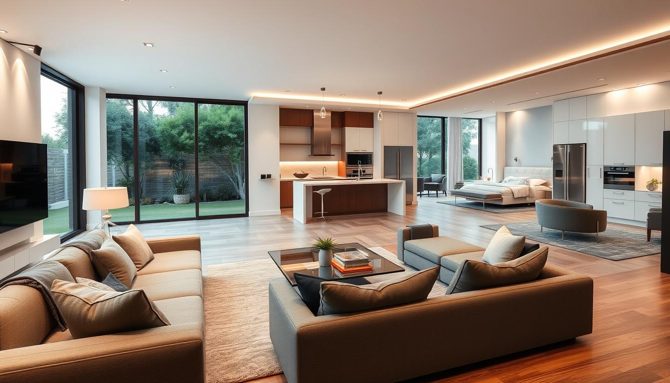
Understanding Modern Home Interior Design Trends
The latest trends in modern home interior design offer a wealth of inspiration for selecting the perfect paint colors. As we explore these trends, it becomes clear that certain themes are influencing how we decorate our homes.
One of the significant trends in modern interior design is the move towards simplicity and clean lines, which has a direct impact on our color choices.
Minimalism and Its Impact on Color Choice
Minimalism has been a driving force in modern interior design, leading to a preference for simpler, more muted color palettes. This design trend emphasizes clean lines, uncluttered spaces, and a limited color scheme, often featuring shades of white, gray, and earthy tones. By adopting a minimalist approach, homeowners can create a sense of calm and serenity in their living spaces.
Key characteristics of minimalist color schemes include:
- A focus on neutral tones
- Limited bold color accents
- An emphasis on texture and natural materials
Popular Color Palettes in Modern Interiors
In modern interiors, popular color palettes often reflect a blend of timeless elegance and contemporary flair. Some of the most popular interior color palettes include:
Monochromatic Neutrals: Using different shades of a single neutral color to create a cohesive look.
Bold and Neutral: Combining bold accent colors with neutral backgrounds to add visual interest.
Nature-Inspired: Drawing from the natural world to incorporate earthy tones and organic textures.
By understanding these trends and popular color palettes, homeowners can make informed decisions when choosing paint colors for their homes. This ensures their spaces are both stylish and reflective of current design trends.
The Psychological Effects of Color in Our Homes
Color in our homes has a big impact on our feelings and actions. The colors we pick can change how we feel, our energy, and our happiness. It’s key to think about how colors can make our homes feel better or worse.
How Color Affects Mood and Atmosphere
Colors can make us feel different things. Warm colors like red, orange, and yellow make us feel energetic and warm. They’re great for places where we hang out, like living rooms and kitchens.
Cool colors like blue, green, and purple calm us down. They’re perfect for bedrooms and bathrooms where we want to relax.
The feel of a room changes with its colors. Light, neutral colors make rooms feel big and open. Dark colors make rooms cozy and intimate. Knowing how colors affect us helps us make our homes feel welcoming and useful.
Choosing Colors for Different Rooms
Each room in our homes has its own job, and colors should match that. For example, a home office might need colors that help us focus, like green or blue. Bedrooms should have colors that help us relax, like soft blues or pale greens.
When picking stylish room paint ideas, think about what each room is for and the mood you want. Modern home decor colors often use neutral colors with bold accent walls. This mix makes rooms look interesting and adds depth.
Choosing colors wisely for each room makes our homes not just look good but also support our mental and emotional health.
Neutrals: The Foundation of Modern Interiors
Neutral tones are key in modern interiors, giving a blank space for personal touch. Shades of white and gray are top picks for their flexibility and lasting charm.
Shades of White and Their Variations
White is a timeless pick for walls, bringing brightness and openness. Different shades of white can alter a room’s feel. Pure white offers a sleek vibe, while off-white adds warmth.
Choosing the right white paint is crucial. Cool undertones bring calm, while warm undertones add coziness. This affects how the color looks under different lights.
The Role of Gray in Contemporary Spaces
Gray is a modern design favorite, adding sophistication. Various shades of gray can change a room’s mood. Light grays expand spaces, while dark grays add depth.
Gray is perfect for highlighting furniture and art. It also pairs well with many colors, making it great for bold or soft accents.
In summary, neutral colors like white and gray are essential for a modern look. Knowing the shades and variations helps homeowners pick the right paint. This choice reflects their style and improves their home.
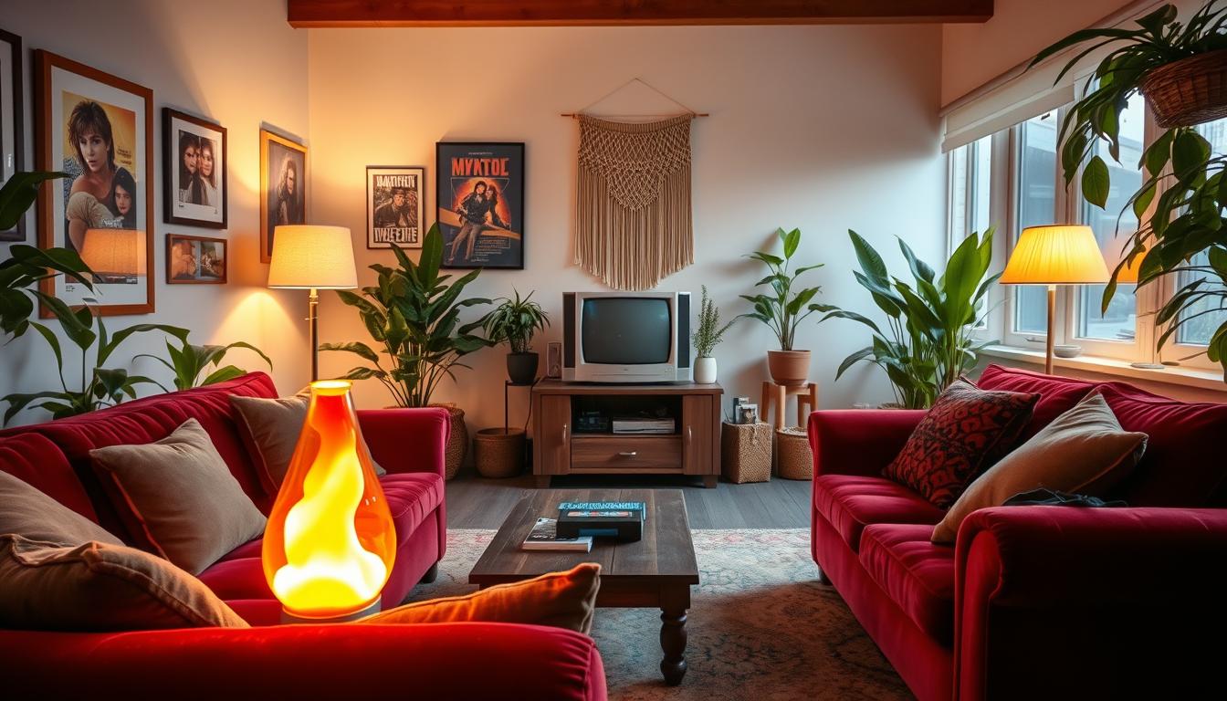
Bold and Vibrant Colors for Statement Spaces
Modern homes are now using bold and vibrant colors to make unique and eye-catching interior spaces. These colors add a personal touch and style, making a space unforgettable.
When to Use Accent Walls
Accent walls are great for adding bold colors without overwhelming a room. They act as a focal point, highlighting a specific area or feature.
Think about the room’s purpose and the light it gets when choosing an accent wall. For example, a bold wall in a home office can boost creativity. In a bedroom, it can make the space cozy and intimate.
Tips for Creating an Accent Wall:
- Choose a wall that naturally draws attention, such as the one behind a fireplace or a staircase.
- Consider the color of the adjacent walls and furniture to ensure harmony.
- Use a color that complements the room’s decor but also stands out.
Popular Bold Colors for Modern Homes
Popular bold colors for modern homes include deep blues, rich greens, and vibrant yellows. These colors add depth and energy to any room.
| Color | Effect | Best Used In |
|---|---|---|
| Deep Blue | Creates a sense of calm and sophistication | Bedrooms, Living Rooms |
| Rich Green | Bringing in a natural element, can be calming or energizing | Home Offices, Kitchens |
| Vibrant Yellow | Stimulates happiness and creativity | Kitchens, Playrooms |
When picking a bold color, think about the look you want and how it will work with the room’s lighting and design.
The Trend of Earthy Tones in Home Design
Earthy tones are a big trend in home design. They add warmth and elegance, making our homes feel connected to nature. Homeowners love them because they bring the outdoors inside.
Embracing Nature-Inspired Colors
Earthy tones include colors like brown, beige, and green. These colors are not just pretty; they also make us feel calm. Using them in our homes makes spaces feel cozy and welcoming.
Some popular earthy tones include:
- Terracotta and sienna, which add warmth and depth to a room
- Sage and moss, which bring in a touch of greenery and freshness
- Umber and chocolate brown, which create a sense of comfort and luxury
How Earthy Tones Enhance Modern Aesthetics
Earthy tones add complexity and interest to modern spaces. They look great with modern furniture, creating a beautiful contrast. This mix of old and new is both appealing and sophisticated.
For example, terracotta and modern furniture make a stunning combination. It adds character to any room.
Earthy tones also help create a unified look in the home. Using the same palette in different rooms makes the home feel connected. It creates a sense of flow and continuity.
Exploring Pastel Colors in Modern Interiors
Modern interiors are now embracing pastel hues. These colors bring a calm vibe to our living spaces. They’re perfect for those who want a peaceful home.

Soft Pastels for a Calming Effect
Colors like pale pink, baby blue, and mint green are great for calmness. They can cover walls, furniture, and decor. This creates a soothing space.
Using soft pastels with neutral tones is key. For example, pale pink walls with white furniture look nice. Adding wood and woven fibers also adds to the calm feel.
Balancing Pastels with Other Colors
It’s important to mix pastels with other colors to avoid too much of one color. The 60-30-10 rule is helpful. It suggests 60% of the room is a main color, 30% a secondary, and 10% an accent (like a pastel).
Here’s a simple table to show how to mix colors:
| Color Component | Percentage | Example Colors |
|---|---|---|
| Dominant Color | 60% | White, Gray |
| Secondary Color | 30% | Soft Pastel (Pale Pink), Natural Wood |
| Accent Color | 10% | Bold Pastel (Mint Green), Gold Accents |
Adding pastel colors to your home decor can make it stylish and calm. Whether updating one room or your whole house, pastels are a modern choice.
Selecting Paint Finishes: Gloss vs. Matte
The finish of your paint greatly affects your walls’ look and durability. Choosing a paint finish is more than picking a shine level. It’s about the room’s function and upkeep.
Each paint finish has its own benefits and drawbacks. Glossy finishes are tough and clean easily, perfect for wet areas like kitchens and bathrooms. Matte finishes, on the other hand, hide flaws well but clean harder.
Pros and Cons of Different Finishes
Here are the pros and cons of various paint finishes:
- Matte Finish: Looks flat, hides imperfections well. But, it’s hard to clean and not very durable.
- Eggshell Finish: Has a slight sheen, more durable than matte, and easier to clean. Great for living areas.
- Satin Finish: Soft sheen, durable, and easy to clean. Ideal for busy areas and frequent cleaning.
- Gloss Finish: Very shiny, durable, and easy to clean. Best for trim and wet areas.
Choosing a paint finish depends on the room’s purpose and your cleaning habits.
Matching Finish to Room Functionality
Each room has unique needs for paint finish. Here’s a guide:
| Room | Recommended Finish | Reason |
|---|---|---|
| Living Room | Eggshell or Satin | Balances looks with durability and cleaning ease. |
| Kitchen | Satin or Gloss | Stands up to moisture and is easy to clean. |
| Bedroom | Matte or Eggshell | Offers a calm, non-reflective look. |
| Bathroom | Gloss | High moisture resistance and easy to clean. |
Choosing the right paint finish for each room boosts your home’s look and keeps walls durable and easy to care for.
Combining Colors: Tips for Cohesion
When picking modern home interior paint colors, mixing them right is crucial. A well-chosen color scheme makes your home look better and feel more welcoming.
To get your colors to work together, it’s important to know how they interact. The 60-30-10 rule is a great tool for balancing your colors.
Using the 60-30-10 Rule
The 60-30-10 rule says to use 60% of a main color, 30% of a secondary color, and 10% of an accent color. This makes your color scheme look balanced and harmonious. For example, pick a neutral like beige or gray for 60%, a color like blue or green for 30%, and a bold color like red or yellow for 10%.

Layering Colors for Depth
Layering colors adds depth and interest to your space. Using different shades and tones of your colors creates a rich look. For instance, layering textures and hues adds complexity to your room. For more on trendy designs, see our guide on trendy interior design homes.
When layering, think about the natural light and how it changes your colors. This technique also helps tie different rooms together with a consistent color scheme.
By following these tips, you can create a popular interior color palette that looks amazing and improves your home’s feel.
The Importance of Lighting in Color Selection
Lighting and color work together in home design. They change how we see and feel our spaces. The right light can make colors pop, so picking the right one is key.
Natural vs. Artificial Light
Natural and artificial light affect color differently. Natural light changes with the day, altering color views. Artificial light stays the same but can change color, affecting how we see colors.
- Natural light makes colors look vibrant and true.
- Artificial light, like lamps, can change color tones.
Warm vs. Cool Light Sources
The light source’s type is crucial. Warm light sources, like incandescent bulbs, have a yellowish hue. Cool light sources, like LEDs, have a bluish tone.
Choosing colors depends on the lighting. For example:
- Warm lighting suits earthy tones and warm colors.
- Cool lighting is good for cool colors and modern schemes.
Knowing how lighting affects color helps us pick better colors for our homes.
The right lighting can make our color choices shine. It creates a welcoming and balanced home atmosphere.
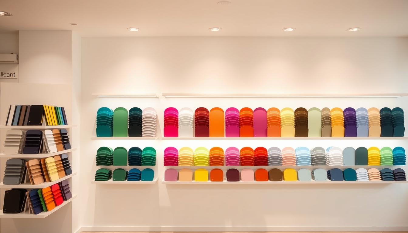
Tools and Resources for Choosing Paint Colors
Finding the perfect paint color is now easier than ever. Thanks to new tools and resources, picking the right hue for your home is simpler. These aids help you achieve stylish room paint ideas that show off your personal style.
Color Swatches and Sample Boards
Color swatches and sample boards are old but still effective. They let you see how different shades will look in your space before you decide. By putting paint samples on your walls, you can see how the color changes with the light.
Color swatches are also great for matching paint with your decor or furniture. For example, if you want to add chic paint trends for interiors to your living room, swatches help you find the right color for your sofa or artwork.
“The right paint color can completely transform a room, making it feel more spacious, cozy, or vibrant, depending on your goals.”
Digital Tools and Apps for Visualization
Digital tools and apps have changed how we pick paint colors. Many paint makers offer online color picker tools and apps. These let you upload a photo of your room and try different colors virtually. This tech gives a better idea of how the final look will be, helping you choose wisely.
Popular digital tools include virtual paint simulators and AR apps. These apps let you see paint colors on your walls in real-time. They make it easy to try out many stylish room paint ideas and chic paint trends for interiors from home.
Using both old and new methods, you can confidently pick the perfect paint color for your home. This ensures a beautiful and unified final look.
Final Thoughts on Choosing the Perfect Paint Colors
Choosing the right paint colors for your home is a personal and creative journey. It’s about understanding modern home decor colors and contemporary wall paints. The colors you pick can greatly change how your living spaces feel and look.
Your personal style is key when picking colors. Whether you like neutrals, bold colors, or earthy tones, your home should show your unique taste. Thinking about color psychology, lighting, and paint finishes helps you make choices that make your home beautiful.
Personalizing Your Space
Try out different colors and techniques to get a look that’s both modern and cozy. Use the 60-30-10 rule or layer colors for depth. Don’t hesitate to experiment with new colors and mixes to find what suits you best.
Creating a Lasting Impression
The colors you choose will shape the mood and feel of your home. They also make a lasting impression on your guests. By using modern home decor colors and contemporary wall paints, you can make a space that’s both stylish and welcoming.